Showing posts with label R. Show all posts

Thursday, April 26, 2012

Visualizing too much data

This week, I got a chance to study a dataset of 13 million rows. Luckily, the file has no strings in it. So my (local) R reads it just fine, except taking a longer time. The original idea is to find a model/systematic pattern that describes the relationship between two fields in the dataset. Most of time, it's a good idea to take a peak at things before rolling sleeves. So now I ended facing the problems of visualizing too much data.

Of course, brute force plotting of every point won't work. The points will step on top of each other. The density of data points will get lost in the sea of points. And it takes forever to run the command. The better solution would be to use hexbin plots, which can handle million+ data points. The data points are first assigned to hexagons that covers the plotting area. Then head counts were done for each cell. At the end, the hexagons got plotted on a color ramp. R has a hexbin package to draw hexbin plots and a few more interesting functions. R ggolot2 package also has a stat_binhex function.

hexbinning that 13 million data points 
Quite surprisingly, I did not find a lot of literatures online regarding this binning techniques. But something to worth noting are:

  • Enrico Bertini has a post regarding things that could be done to deal with visualizing a lot data.
  • Zachary Forest Johnson has a post devoted to hexbins exclusively, which is very helpful.
  • Last but not least, the hexbin package documentation talks about why hexagons not squares, and the algorithms to generate those hexagons.

Monday, February 13, 2012

Funnel plot, bar plot and R

I just finished my Omniture SiteCatalyst training in Mclean, VA a few days ago. It was ok (somehow boring), we only went through how to click buttons inside SiteCatalyst to generate reports, not necessarily how to implement it and let it track the information we want to track.

I got two impressions out of the class: one is Omniture is great and powerful web analytical tool; another is the funnel plots could be misleading from data visualization perspective. For example, regardless of why the second event 'Reg Form Viewed' has higher frequency than first event 'Web Landing Viewed', the funnel bar for second event is still narrower than the one for first event. Just because it's designed to be the second stage in the funnel report.


This is a typical example of visualization components do not match up the numbers. There could be other types of funnel plots that are misleading as well, as pointed out by Jon Peltier in his blog article. I totally agree with him on using the simple barplot to be an alternative for the funnel plots. And I also like his idea of adding another plot for visualizing some small yet important metric, like purchases as shown in his example.

Then I turned into R to see if I can do some quick poking around on how to display the misleading funnel I have here into something meaningful and hopefully beautiful. Since I always feel like I don't have a good grasp on how to do barplots in R, this is going to be a good exercise for me.

As always, figuring out the 3-letters parameters for base package plot function is painful. And I had to set up appropriate size of margins, so that my category names won't be cut off.

Then I drew the same plot using ggplot2. All the command names make sense. And the plot is built up layer by layer. However, I did not manage to get the x-axis to the top of the plot, which will involve creating new customized geom.


There are some nice R barchart tips on the web, for example on learning_r, stackoverflow, and gglot site. Anyway, this is what I used

##### barchart

dd = data.frame(cbind(234, 334, 82, 208, 68))
colnames(dd) = c('web_landing_viewed', 'reg_form_viewed', 'registration_complete', 'download_viewed', 'download_clicked')
dd_pct = round(unlist(c(1, dd[,2:5]/dd[,1:4]))*100, digits=0)

# plain barchart horizontal
#control outside margin so the text could be equeezed into the plot
par(omi=c(0.1,1.4,0.1,0.12))
#las directions of tick labels for x-y axis, range 0-3, so 4 combinations
mp<-barplot(as.matrix(rev(dd)), horiz=T, col='gray70', las=1, xaxt='n');
tot = paste(rev(dd_pct), '%');
# add percentage numbers
text(rev(dd)+17, mp, format(tot), xpd=T, col='blue', cex=.65)
# axis on top(side=3),'at' ticks location, las: parallel or pertanculiar to axis
axis(side=3,at=seq(from=0, to=30, by=5)*10, las=0)

# with ggplot2
dd2=data.frame(metric=c('web_landing_viewed', 'reg_form_viewed', 'registration_complete', 'download_viewed', 'download_clicked'), value=c(234, 334, 82, 208, 68))

ggplot(dd2, aes(metric, value)) + geom_bar(stat='identity', fill=I('grey50')) + coord_flip() + ylab('') + xlab('') + geom_errorbar(aes(ymin = value+10, ymax = value+10), size = 1) + geom_text(aes(y = value+20, label = paste(dd_pct, '%', sep=' ')), vjust = 0.5, size = 3.5)

Friday, July 15, 2011

Overlay two heatmaps in R

To-do: two heatmaps on two data sets with same dimension, overlay one over the other. For example, you have now heatmap 1 and 2 like these (generated in R, dataset is 4 by 2). How to overlay red one on top of the green one?
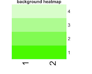

Well, I really hope this problem is as easy as overlay two pieces of paper. Unfortunately there are a few extra miles to go. The steps are clear though:
  1. get the rgb number on the corresponding position for paint and background heatmap, regardless of the values in the dataset
  2. merge two rgbs cell by cell
  3. plot the result rgb color matrix.
Before that, understanding how R assign colors to data from a color list, is needed. I actually played with some toy datasets and color list. Then I found that R will arrange data from smallest to biggest, and then assign colors according to the rank, so that the smallest and biggest will get the beginning and end of the color list. Say you have color c1 to color c8, and your ranked data set is (1,2,3,4). R will assign color c8 to 4, color c1 to 1. Color b and c will get in this case get color c3 (ceiling ((2-1)/(4-1)*8) and color c6. Thus given the color list a heatmap uses and the dataset that's been plotted, one can calculate which color is used to plot which data point. Well, I wrote a R function to accomplish this

heatmap_col <- function(val_array, col_list) {

minv = min(val_array)
maxv = max(val_array)

out = val_array
for( i in 1:nrow(val_array))
for( j in 1:ncol(val_array))
# take max of 1 or the other value in case 0 is the ceiling result
out[i,j] = col_list[max(1, ceiling((val_array[i,j] - minv) / (maxv - minv) * length(col_list)))]

out
}

With this then, I can easily get the rgb used on each cell of the heatmap. However, the returns are simply rgb code, like '#FF000045'(red,green,blue,alpha). We need to know the exact numbers of red, green, blue and even alpha, which are critical for the blending. After some serious googling, I found this colorful presentation very helpful. It contains a hex constant table, which could be used to break down rgb color into 4 numbers between 0 and 1, corresponding to red, green, blue and alpha. R code is here

hex_constant = data.frame(hex=c(seq(from=0, to=9, by=1), toupper(letters[1:6])), decimal=seq(from=0, to=15, by=1), stringsAsFactors=F)


rgb2hex_number <- function(x, hex_constant){

num_collector = hex_constant$decimal[hex_constant$hex == toupper(substr(x, start=2, stop=2))]
for(i in 3:nchar(x))
num_collector = c(num_collector, hex_constant$decimal[hex_constant$hex == toupper(substr(x, start=i, stop=i)]))

R = (num_collector[1]*16+num_collector[2])/255
G = (num_collector[3]*16+num_collector[4])/255
B = (num_collector[5]*16+num_collector[6])/255

with_alpha = ifelse(nchar(x) > 7, TRUE, FALSE)

if(with_alpha) {
A = (num_collector[7]*16+num_collector[8])/255
return(c(R, G, B, A))
} else { # fill in alpha of 0
return(c(R, G, B, 0))
}
}


The next step is to merge two rgb numbers on the same position. Two stackoverflow posts (here and there) talked about how to do it in python. If one happens to look up in wikipedia, one has to be skeptical with it.
Wiki is wrong about the operation could be associative. It's actually not, meaning switching background and paint colors while blending can yield different color. A quick algebra is enough. The R code for this step is trivial.

mix_2rgb <- function(x, y){
# x is the paint color, y is the background color
# NOTICE: this operation is not associative. Switching x and y may yield different result.

# lookup table of hex and decimal
hex_constant=data.frame(hex=c(seq(from=0, to=9, by=1), toupper(letters[1:6])), decimal=seq(from=0, to=15, by=1), stringsAsFactors=F)

# belending two rgb colors evenly
x_out = rgb2hex_number(x, hex_constant)
y_out = rgb2hex_number(y, hex_constant)

# with alpha channel considered
ax = 1- (1 - x_out[4]) * (1 - y_out[4])

if( ax > 0 ) {

rx = x_out[1] * x_out[4] / ax + y_out[1] * y_out[4] * (1 - x_out[4]) / ax
gx = x_out[2] * x_out[4] / ax + y_out[2] * y_out[4] * (1 - x_out[4]) / ax
bx = x_out[3] * x_out[4] / ax + y_out[3] * y_out[4] * (1 - x_out[4]) / ax

return(rgb(rx, gx, bx, ax))

} else {

rx = (x_out[1] + y_out[1]) / 2
gx = (x_out[2] + y_out[2]) / 2
bx = (x_out[3] + y_out[3]) / 2

return(rgb(rx, gx, bx))
}
}


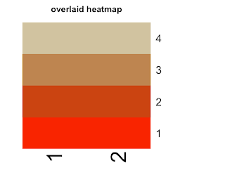
The last step is a little bit tricky. Since all I have for now is the colors I want to plot at each cell, but I don't have a data matrix to pass to "heatmap" function. So I have to do a hack using "rect" function. Anyway, This is the end result. Not bad, huh?
Thursday, June 16, 2011

One-linear R: multiple ggplots on one page

First, par(mfrow=c(nrow,ncol)) does not go together with ggplot2 plots. Too bad, the simplest way I know of just wouldn't work.

There are two solutions I found out. The first is posted here. It's a smart function that performs par(mfrow) tasks. I just copied the code here
# Source: http://gettinggeneticsdone.blogspot.com/2010/03/arrange-multiple-ggplot2-plots-in-same.html

# Function used below in the function 'arrange'
vp.layout <- function(x, y) viewport(layout.pos.row=x, layout.pos.col=y)

# Function to plot multiple ggplots together
arrange <- function(..., nrow=NULL, ncol=NULL, as.table=FALSE) {
dots <- list(...)
n <- length(dots)
if(is.null(nrow) & is.null(ncol)) { nrow = floor(n/2) ; ncol = ceiling(n/nrow)}
if(is.null(nrow)) { nrow = ceiling(n/ncol)}
if(is.null(ncol)) { ncol = ceiling(n/nrow)}

## NOTE see n2mfrow in grDevices for possible alternative
grid.newpage()
pushViewport(viewport(layout=grid.layout(nrow,ncol) ) )
ii.p <- 1
for(ii.row in seq(1, nrow)){
ii.table.row <- ii.row
if(as.table) {ii.table.row <- nrow - ii.table.row + 1}

for(ii.col in seq(1, ncol)){
ii.table <- ii.p
if(ii.p > n) break
print(dots[[ii.table]], vp=vp.layout(ii.table.row, ii.col))
ii.p <- ii.p + 1
}}}

Another solution would be to use the 'grid.arrange' function in 'gridExtra' package. This function cooperates with not only plots, but also tables ('tableGrob'). So a plot can have both plots and text tables in it. And it has more controls over the title and sub titles. Very slick!

# Test
x <- qplot(mpg, wt, data=mtcars)
y <- qplot(1:10, letters[1:10])
arrange(x, y, nrow=1)
grid.arrange(x, y, ncol=1)

Wednesday, June 15, 2011

Use LDA Models on User Behaviors

LDA (Latent Dirichlet Allocation) model is a Bayesian statistical technique that is designed to find hidden (latent) groups of the data. For example, LDA helps to find topics (latent groups of individual words) among large document corpora. LDA is a probabilistic generative model, i.e., it assumes a generating mechanism underneath the observations and then use the observations to infer the parameters for the underlying mechanism.

When trying to find the topics among documents, LDA makes the following assumptions:
  • ignoring the order of words, documents are simply bags of words and documents exhibits multiple topics.
  • topics have distributions over words. So each word could appear in all the topics with different probabilities though. Say "transmission" will have a higher probability in the topic about auto repair, but lower probability in the topic about child education.
  • each document is obtained by choosing some topics proportions, say {(topic A: .55), (topic B: .20), (topic C: 25)}.
  • and for each word inside a document, choosing a topic from those proportions (say you randomly got number .6 (between 0 and 1 of course), the topic got chosen is B) then looking at the topic over words distribution and drawing a word from that topic (say word X).

Only the actual words are visible to us, so inference has to be made on per-word topic assignment, per-document topic proportion and per-corpus topic distribution. Dirichlet distributions are chosen to be the prior distributions for the latter two distributions. And various algorithms are used to make the inference, like Gibbs sampling (implemented in R package 'topicmodels').

LDA assumes a fixed number of topics existing in a document corpora and assigns soft membership of the topics to documents (i.e, a topic could be exhibited in multiple documents). Indeed, LDA is under a bigger umbrella called "mixed membership model framework" [refer to source [1] for more) .

The soft assignment and mixed membership nature of LDA models make it a reasonable candidate for user behavior analysis, particularly user behavior through a certain period of time. Say one has a log of user behavior at different stage of user life cycle (1st day, 2nd day, etc of a user's life). Then one can treat behavior as words, each day's users aggregated behavior log as document, and let LDA figure out the topics (group of behaviors that tend to appear together, 'co-appearance') and the proportions of the topics. And that will give some idea on how behavior of the group evolves over time. A R visualization could look like this (each tick on the y axis represents a topic).


However, I do find that sometime LDA tries too hard on discovering topics with niche words (after filtering out stop words and rare words). Depending on application, this could be a bless or a curse.

sources:
[1] http://www.cs.cmu.edu/~lafferty/pub/efl.pdf
[2] http://videolectures.net/mlss09uk_blei_tm/
[3] http://cran.r-project.org/web/packages/topicmodels/index.html
[4] http://www.cs.princeton.edu/~blei/

Tuesday, June 14, 2011

One-linear R: neat way to slice the data

Recently found out that library 'caret' has a few interesting functions, which are very handy to do the following tasks:
series of test/training partition (createDataPartition function)
create one or more bootstrap samples (createResample function)
split the data into k groups (createFolds function)

'Caret' is a super wrapper package. One can run different type of models by calling functions in this package only.

Friday, May 27, 2011

One-liner R: remove data frame columns by names

Sometime, I want to remove some columns from my data. What I did in that case, is found out what are the unwanted column ids and removed those. It's just a couple of lines in R. But why not write a function to do the job and also some error handling. So next time, I just copy and paste!
rm.col.by.name <- function(dat, colname.list){

l1 = length(colname.list)
l2 = which(colnames(dat) %in% colname.list)

if(length(l2) == 0) {
    warning('Did not find any matching columns. Check input column names, please.')
}

if(length(l2) > 0 & length(l2) < l1) {
    warning('Did not find all matching columns. Only those found are removed.')
    return(dat[,-c(l2)])
} 

if(length(l2) > 0 & length(l2) == l1) {
    return(dat[,-c(l2)])
}

}

Friday, January 14, 2011

Market Basket Analysis using R

R has a package that deals with association rule mining tasks. Its name is "arules". It implemented Apriori algorithm and Eclat by calling C in the back-end.

I found a small transaction dataset (2k rows) online, which has 2 columns 'order_id' and 'item'. The first few rows look like this

/*
10248 item042
10248 item072
10249 item014
10249 item051
10250 item041
10250 item051
...
*/

Then I performed the following R codes to analyze this data

## call the 'arules' library [if you have not installed it, run "install.packages('arules')" in R.]
library(arules)

## import the data
# read.transactions is a very nice function to read
# in this type of transaction data very quickly.
# I have seen others reading the data using read.table
# and then transform it, which was too much manipulation.
# "format" argument tells R if each line has just one item
# (single) or multiply items (basket) seperated by "sep="
# "cols" argument is a numeric vector of length 2 giving
# the numbers of the columns with the transaction and item ids
# for single format. And it can be a numeric scalar
# giving the number of the column with transaction ids
# for basket format.
trans_data <- read.transactions(file='trans_data.csv', rm.duplicates=F, format='single', sep=',', cols=c(1,2))

# take a peak at what's in each basket
inspect(trans_data)

## after reading the data in, there are some trivial
#functions you can use on it

class(trans_data)
summary(trans_data)

## for each item, you can count the frequency of appearance
# or ratio of appearance relative to total number of transactions
itemFrequency(trans_data, type='absolute')
itemFrequency(trans_data, type='relative')
## item_freq/total_num_of_orders

## there are some visualization functions one can use
# to "see" the data
image(trans_data)
itemFrequencyPlot(trans_data)

## apply Apriori algorithms to mine association rules
# there are a few parameters that you can tweak with,
# see the package manual instruction on 'APparameter-class'
# in this example, I specifically tell R I want 1-way rules that
# has minsupport of .002 and minconfidence of .2 by setting up
# parameters in the following way

rules <- apriori(trans_data, parameter = list(supp = 0.002, conf = 0.2, target = "rules", maxlen=2, minlen=1))

parameter specification:
confidence minval smax arem aval originalSupport support minlen maxlen target
0.2 0.1 1 none FALSE TRUE 0.002 1 2 rules
ext
FALSE

algorithmic control:
filter tree heap memopt load sort verbose
0.1 TRUE TRUE FALSE TRUE 2 TRUE

Warning in apriori(trans_data, parameter = list(supp = 0.002, conf = 0.2, :
You chose a very low absolute support count of 1. You might run out of memory! Increase minimum support.

apriori - find association rules with the apriori algorithm
version 4.21 (2004.05.09) (c) 1996-2004 Christian Borgelt
set item appearances ...[0 item(s)] done [0.00s].
set transactions ...[77 item(s), 830 transaction(s)] done [0.01s].
sorting and recoding items ... [77 item(s)] done [0.00s].
creating transaction tree ... done [0.00s].
checking subsets of size 1 2 done [0.00s].
writing ... [30 rule(s)] done [0.00s].
creating S4 object ... done [0.00s].

## check rules
inspect(rules[30])
# lhs rhs support confidence lift
# 1 {item021} => {item061} 0.009638554 0.2051282 7.094017


## extract measurments or other stuff you want
str(rules)
attributes(rules)$quality

The same rule showed up in the query mining too. The support, confidence and lift metrics match up between R and sql.

-[ RECORD 1 ]-----+-------------------------
rules | item021 => item061
lhs | item021
rhs | item061
num_lhs_rhs | 8.0
num_basket | 830.0
num_lhs | 39.0
num_rhs | 24.0
num_no_lhs | 791.0
num_no_rhs | 806.0
num_lhs_no_rhs | 31.0
num_no_lhs_rhs | 16.0
num_no_lhs_no_rhs | 775.0
support | 0.0096385542168
confidence | 0.2051282051282
lift | 7.0940170940170
chi_square | 45.253247622206
laplace | 0.2195121951219
conviction | 1.2216867469879
added_value | 0.1762125424776
certainty_factor | 0.1814595660749
j_measure | 0.0114057917394
gini_index | 0.0030619052969
jaccard | 0.1454545454545
shapiro | 0.0082798664537
cosine | 0.2614881801842
correlation | 0.2334994327337
odds_ratio | 12.500000000000

Wednesday, November 3, 2010

Convert R "xtabs" object to a dataframe

Lately, I used R's "xtabs" command to generate a 2 dimension contingency table. Then I tried to merge the result with a dataframe object I created earlier. However "merge" function does not like the miss-match input types, meaning I have to transform the xtabs result to a dataframe. The challenges are (1) the regular as.data.frame did not work. I have to use as.data.frame.matrix (2) the column's naming convention is not the ones I'd like it to be. So I write a little R function to accomplish the task of converting xtabs objects to dataframes.

# define x
x <- data.frame(id=c(123,123), model=c(2,3), value=c(2.73,0.36))

# > x
# id model value
# 1 123 2 2.73
# 2 123 3 0.36

# create 2 dimension xtab variable
aa <- xtabs(value~id+model, data=x)

xtabs_2_dataframe <- function(aa){
# figure out column names that are originally used in the xtabs call
nm_tmp <- attributes(dimnames(aa))$names
if(length(nm_tmp) != 2){
# this function only handles 2 dimension xtabs object
cat('Error: the input xtabs object has to have at most 2 dimensions!\n')
#return(NULL)
} else {
bb <- as.data.frame.matrix(aa)

# playing aroun d
colnames(bb) <- paste(nm_tmp[2], colnames(aa), sep='_')
bb$newcol <- dimnames(bb)[[1]]
colnames(bb)[ncol(bb)] <- nm_tmp[1]
rownames(bb) <- NULL

cc=data.frame(bb[, ncol(bb)], bb[, 1:(ncol(bb)-1) ], stringsAsFactors = F)
colnames(cc)[1]=nm_tmp[1]
return(cc)
} }

# > xtabs_2_dataframe(aa)
# id model_2 model_3
# 1 123 2.73 0.36
# > str(xtabs_2_dataframe(aa))
# 'data.frame': 1 obs. of 3 variables:
# $ id : chr "123"
# $ model_2: num 2.73
# $ model_3: num 0.36


Of course, you may ask why not use cast function in reshape package? Well, I tried that and got a list object. So if I want a data frame, I have to process that too, for example using do.call(cbind,...) and assign the proper column names.

# > cast(x, id~model+value)
# id 2_2.73 3_0.36
# 1 123 2.73 0.36
# > str(y<-cast(x, id~model+value))
# List of 3
# $ id : num 123
# $ 2_2.73: num 2.73
# $ 3_0.36: num 0.36
# - attr(*, "row.names")= int 1
# - attr(*, "idvars")= chr "id"
# - attr(*, "rdimnames")=List of 2
# ..$ :'data.frame': 1 obs. of 1 variable:
# .. ..$ id: num 123
# ..$ :'data.frame': 2 obs. of 2 variables:
# .. ..$ model: num [1:2] 2 3
# .. ..$ value: num [1:2] 2.73 0.36

Friday, July 9, 2010

R functions that handle binary response

Lately, I have been working with data that has binary response in R.

The project's focus is to predict user's click probability given Two main characters about My predictors this time are all numerical.

To me, R has evolved to a point where serious summary and information aggregation are needed. That's why I think r-bloggers is a terrific idea and highly recommend it to every R beginner like myself.

Well, this post is meat to be a summary page on some of the R functions/packages that I found would handle binary response data and maybe also perform variable selection at the same time. Of course, they might handle other type of responses also, like Gaussian or Poisson. But this post is written from the perspective of binary responses or success/failure counts

Next, I am going to list them by function name, and give a brief example-like syntax template.


# glm
** package: default
** input format: glm(Y~X1+X2, data, family='binomial', ...) or glm(cbind(success, total-success)~X1+X2, data, family='binomial')
** variable selection: no, unless manual tweaking or use functions from other packages to help selecting predictors, like 'stepAIC' in MASS package. It will have an ANOVA table for predictors, however won't necessarily choose the best set.

# gbm
** package: gbm (Generalized Boosted Regression Models)
** input format: gbm(Y~X1+X2, data, distribution=c('bernoulli', 'adaboost'), ...)
** variable selection: yes.

# gl1ce
** package: lasso2 (L1 Constrained Estimation)
** input format: similar to glm
** variable selection: yes.

# earth
** package: earth (Multivariate Adaptive Regression Spline Models)
** input format: earth(Y~X1+X2, data, glm=list(family=binomial), ...) or earth(cbind(success, total-success)~X1+X2, glm=list(family=binomial), ...)
** variable selection: yes.

# bestglm
** package: bestglm (Best subset glm using AIC, BIC, EBIC, BICq or Cross-Validation)
** input format: bestglm(Xy, family='binomial', IC=..., ...) (Dataframe containing the design matrix X and the output variable y. All columns must be named. I think y must be binary.
** variable selection: yes.

# step.plr (L2 Penalized Logistic Regression with a Stepwise Variable Selection)
** package: stepPlr
** input format: step.plr(X, Y, type=c("both", "forward", "forward.stagewise"), ...)
** variable selection: yes.

Thursday, December 10, 2009

ggplot2 is so much fun!

I finally received my ggplot2 book and started my learning process of this "new" package. I will keep adding some tips here, so I will a place to look back later.

1. change axis label
p + scale_x_continuous("x axis label") +scale_y_continuous("y axis label")

2. change ticks and labels for axises
p + scale_x_continuous(breaks=seq(1,2.5,by=.5),labels=letters[1:5])