Thursday, April 26, 2012

Visualizing too much data

This week, I got a chance to study a dataset of 13 million rows. Luckily, the file has no strings in it. So my (local) R reads it just fine, except taking a longer time. The original idea is to find a model/systematic pattern that describes the relationship between two fields in the dataset. Most of time, it's a good idea to take a peak at things before rolling sleeves. So now I ended facing the problems of visualizing too much data.

Of course, brute force plotting of every point won't work. The points will step on top of each other. The density of data points will get lost in the sea of points. And it takes forever to run the command. The better solution would be to use hexbin plots, which can handle million+ data points. The data points are first assigned to hexagons that covers the plotting area. Then head counts were done for each cell. At the end, the hexagons got plotted on a color ramp. R has a hexbin package to draw hexbin plots and a few more interesting functions. R ggolot2 package also has a stat_binhex function.

hexbinning that 13 million data points 
Quite surprisingly, I did not find a lot of literatures online regarding this binning techniques. But something to worth noting are:

  • Enrico Bertini has a post regarding things that could be done to deal with visualizing a lot data.
  • Zachary Forest Johnson has a post devoted to hexbins exclusively, which is very helpful.
  • Last but not least, the hexbin package documentation talks about why hexagons not squares, and the algorithms to generate those hexagons.

Tuesday, April 17, 2012

Some Python

The other day, I was trying to flag a posted (to the Redis server for quick lookup) recommendation from a dictionary of recommendations. Then the next round, I could do some weighted random sampling among the unposted ones, without actually going through the entire recommendation calculations. Anyway, it's a little bit tricky to neatly flag a 'used' recommendation in a python dictionary. Fortunately, someone has already provided a solution. I'd like to borrow it over for quick references.
>>> x = {'a':1, 'b': 2}
>>> y = {'b':10, 'c': 11}
>>> z = dict(x.items() + y.items())
>>> z
{'a': 1, 'c': 11, 'b': 10}

b's vlaue is properly overwritten by the value in second dictionary. In Python 3, this is suggested
>>> z = dict(list(x.items()) + list(y.items()))
>>> z
{'a': 1, 'c': 11, 'b': 10}


And I saw a cool post about using python's map, reduce, filter function to a dictionary. Once again, something could be cleanly and flexibly accomplished. Python is such a beautiful language.

Wednesday, February 29, 2012

Day 2 @ Strata 2012

The day went by very fast. However not a lot of interesting topics though. The keynote talks by Ben Goldacre and Avinash Kaushik were all right. Then the Netflix one was interesting, the speaker talked about what (quite a lot of) other things Netflix does beyond predicting ratings. The 'science of data visualization' was informative too.

One interesting observation I made today was that during the break hour, the man's room had lines, while the ladies' did not. That's totally different from other places I have been to, for example, the shopping mall. :P

Tuesday, February 28, 2012

Go Strata! Go DATA!

Today I finally walked in the Strata Conference for Data (and thank God that I live in California now.) I was quite excited about this, because there are tons going on in this conference. And people won't think you are a nerd, when you express your passion on ... DATA. Well, in my mind, the entire universe is a big dynamic information system. And what's floating inside the system? Of course, the data! And knowing more about data essentially helps people understand the system better, the universe better! It's so importance that it will become bigger and bigger part of your life. And maybe someday people will think data as vital as water and air :)

Anyway, today is the training day of Strata. I chose the 'Deep Data' track. The speakers were all fantastic! It's a great opportunity to see what others actually do with data and how they do it, instead of the tutorial sections where people just talk about the data. The talks I enjoyed the most are Claudia Perlich's 'From knowing what to understanding why' (she really has no holdout on the practical data mining tips. And I like the fact that she baked a lot of statistics knowledge into problem solving, which in my mind is missing on some of the data scientists. And I really like the assertive attitude when she said 'I will even look at the data, if somebody else pulled it'.), Ben Gimpert's 'The importance of importance: introduction to feature selection' (well, I always like these type of high level summary talks.), and, Matt Biddulph's 'Social network analysis isn't just for people' (the example that most impressed me is he used the fact that developers often listen to music while they write their code, so there is a connection between music and the programing language. Something that seems totally unrelated got brought into the wok and cooked together. Besides, he had some cool visualization using Gephi.)

At the end of day, there is an hour long debate between leading data scientist in the field (most of them came or come from Linkedin). The topic was 'Does domain expertise matters more than machine learning expertise?', meaning when you trying to assemble a team and make hire, do you have the machine learning guy or the domain expert? I personally vote against the statement, and I think the machine learning expertise matters more when I try to make the first hire. Think about it this way: when you have such an opening, you, the company should at least have idea about what you trying to solve (unless you are starting a machine learning consulting company, in which case the first hire better be machine learning people). So at that time, you already have some business domain experts inside your company. Then bringing in data miners will help you solve the problem that a domain expert couldn't solve. For example, your in-house domain expert could complain about data not very accessible, or too many predictors they don't know how and which one to look at. A machine learning person hopefully could provide advice on data storage, data processing, and modeling knowledge to help you sort out the data into some workable format, and systematically tell you that you are spending too much time on the features that do not make any difference and some other features should get more of your attention. To me, it's always an interactive feedback system between your data person and your domain expertise. And it's the way of thinking about business problems systematically in an approachable and organized fashion that values the most, not necessarily how many models or techniques that machine learning candidates knows.

Overall, Strata is a well-organized conference, that I want to attend every year!

Monday, February 13, 2012

Funnel plot, bar plot and R

I just finished my Omniture SiteCatalyst training in Mclean, VA a few days ago. It was ok (somehow boring), we only went through how to click buttons inside SiteCatalyst to generate reports, not necessarily how to implement it and let it track the information we want to track.

I got two impressions out of the class: one is Omniture is great and powerful web analytical tool; another is the funnel plots could be misleading from data visualization perspective. For example, regardless of why the second event 'Reg Form Viewed' has higher frequency than first event 'Web Landing Viewed', the funnel bar for second event is still narrower than the one for first event. Just because it's designed to be the second stage in the funnel report.


This is a typical example of visualization components do not match up the numbers. There could be other types of funnel plots that are misleading as well, as pointed out by Jon Peltier in his blog article. I totally agree with him on using the simple barplot to be an alternative for the funnel plots. And I also like his idea of adding another plot for visualizing some small yet important metric, like purchases as shown in his example.

Then I turned into R to see if I can do some quick poking around on how to display the misleading funnel I have here into something meaningful and hopefully beautiful. Since I always feel like I don't have a good grasp on how to do barplots in R, this is going to be a good exercise for me.

As always, figuring out the 3-letters parameters for base package plot function is painful. And I had to set up appropriate size of margins, so that my category names won't be cut off.

Then I drew the same plot using ggplot2. All the command names make sense. And the plot is built up layer by layer. However, I did not manage to get the x-axis to the top of the plot, which will involve creating new customized geom.


There are some nice R barchart tips on the web, for example on learning_r, stackoverflow, and gglot site. Anyway, this is what I used

##### barchart

dd = data.frame(cbind(234, 334, 82, 208, 68))
colnames(dd) = c('web_landing_viewed', 'reg_form_viewed', 'registration_complete', 'download_viewed', 'download_clicked')
dd_pct = round(unlist(c(1, dd[,2:5]/dd[,1:4]))*100, digits=0)

# plain barchart horizontal
#control outside margin so the text could be equeezed into the plot
par(omi=c(0.1,1.4,0.1,0.12))
#las directions of tick labels for x-y axis, range 0-3, so 4 combinations
mp<-barplot(as.matrix(rev(dd)), horiz=T, col='gray70', las=1, xaxt='n');
tot = paste(rev(dd_pct), '%');
# add percentage numbers
text(rev(dd)+17, mp, format(tot), xpd=T, col='blue', cex=.65)
# axis on top(side=3),'at' ticks location, las: parallel or pertanculiar to axis
axis(side=3,at=seq(from=0, to=30, by=5)*10, las=0)

# with ggplot2
dd2=data.frame(metric=c('web_landing_viewed', 'reg_form_viewed', 'registration_complete', 'download_viewed', 'download_clicked'), value=c(234, 334, 82, 208, 68))

ggplot(dd2, aes(metric, value)) + geom_bar(stat='identity', fill=I('grey50')) + coord_flip() + ylab('') + xlab('') + geom_errorbar(aes(ymin = value+10, ymax = value+10), size = 1) + geom_text(aes(y = value+20, label = paste(dd_pct, '%', sep=' ')), vjust = 0.5, size = 3.5)

Friday, July 15, 2011

Overlay two heatmaps in R

To-do: two heatmaps on two data sets with same dimension, overlay one over the other. For example, you have now heatmap 1 and 2 like these (generated in R, dataset is 4 by 2). How to overlay red one on top of the green one?
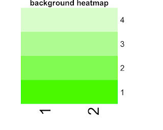

Well, I really hope this problem is as easy as overlay two pieces of paper. Unfortunately there are a few extra miles to go. The steps are clear though:
  1. get the rgb number on the corresponding position for paint and background heatmap, regardless of the values in the dataset
  2. merge two rgbs cell by cell
  3. plot the result rgb color matrix.
Before that, understanding how R assign colors to data from a color list, is needed. I actually played with some toy datasets and color list. Then I found that R will arrange data from smallest to biggest, and then assign colors according to the rank, so that the smallest and biggest will get the beginning and end of the color list. Say you have color c1 to color c8, and your ranked data set is (1,2,3,4). R will assign color c8 to 4, color c1 to 1. Color b and c will get in this case get color c3 (ceiling ((2-1)/(4-1)*8) and color c6. Thus given the color list a heatmap uses and the dataset that's been plotted, one can calculate which color is used to plot which data point. Well, I wrote a R function to accomplish this

heatmap_col <- function(val_array, col_list) {

minv = min(val_array)
maxv = max(val_array)

out = val_array
for( i in 1:nrow(val_array))
for( j in 1:ncol(val_array))
# take max of 1 or the other value in case 0 is the ceiling result
out[i,j] = col_list[max(1, ceiling((val_array[i,j] - minv) / (maxv - minv) * length(col_list)))]

out
}

With this then, I can easily get the rgb used on each cell of the heatmap. However, the returns are simply rgb code, like '#FF000045'(red,green,blue,alpha). We need to know the exact numbers of red, green, blue and even alpha, which are critical for the blending. After some serious googling, I found this colorful presentation very helpful. It contains a hex constant table, which could be used to break down rgb color into 4 numbers between 0 and 1, corresponding to red, green, blue and alpha. R code is here

hex_constant = data.frame(hex=c(seq(from=0, to=9, by=1), toupper(letters[1:6])), decimal=seq(from=0, to=15, by=1), stringsAsFactors=F)


rgb2hex_number <- function(x, hex_constant){

num_collector = hex_constant$decimal[hex_constant$hex == toupper(substr(x, start=2, stop=2))]
for(i in 3:nchar(x))
num_collector = c(num_collector, hex_constant$decimal[hex_constant$hex == toupper(substr(x, start=i, stop=i)]))

R = (num_collector[1]*16+num_collector[2])/255
G = (num_collector[3]*16+num_collector[4])/255
B = (num_collector[5]*16+num_collector[6])/255

with_alpha = ifelse(nchar(x) > 7, TRUE, FALSE)

if(with_alpha) {
A = (num_collector[7]*16+num_collector[8])/255
return(c(R, G, B, A))
} else { # fill in alpha of 0
return(c(R, G, B, 0))
}
}


The next step is to merge two rgb numbers on the same position. Two stackoverflow posts (here and there) talked about how to do it in python. If one happens to look up in wikipedia, one has to be skeptical with it.
Wiki is wrong about the operation could be associative. It's actually not, meaning switching background and paint colors while blending can yield different color. A quick algebra is enough. The R code for this step is trivial.

mix_2rgb <- function(x, y){
# x is the paint color, y is the background color
# NOTICE: this operation is not associative. Switching x and y may yield different result.

# lookup table of hex and decimal
hex_constant=data.frame(hex=c(seq(from=0, to=9, by=1), toupper(letters[1:6])), decimal=seq(from=0, to=15, by=1), stringsAsFactors=F)

# belending two rgb colors evenly
x_out = rgb2hex_number(x, hex_constant)
y_out = rgb2hex_number(y, hex_constant)

# with alpha channel considered
ax = 1- (1 - x_out[4]) * (1 - y_out[4])

if( ax > 0 ) {

rx = x_out[1] * x_out[4] / ax + y_out[1] * y_out[4] * (1 - x_out[4]) / ax
gx = x_out[2] * x_out[4] / ax + y_out[2] * y_out[4] * (1 - x_out[4]) / ax
bx = x_out[3] * x_out[4] / ax + y_out[3] * y_out[4] * (1 - x_out[4]) / ax

return(rgb(rx, gx, bx, ax))

} else {

rx = (x_out[1] + y_out[1]) / 2
gx = (x_out[2] + y_out[2]) / 2
bx = (x_out[3] + y_out[3]) / 2

return(rgb(rx, gx, bx))
}
}


The last step is a little bit tricky. Since all I have for now is the colors I want to plot at each cell, but I don't have a data matrix to pass to "heatmap" function. So I have to do a hack using "rect" function. Anyway, This is the end result. Not bad, huh?
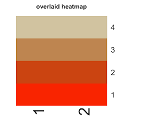
Thursday, July 7, 2011

A Few Things Learned on Hadoop Streaming

In the past couple of days, I tried to run some map-reduce jobs on EMR through python streaming. The API I used is boto. It's really basic and not very documented. I was only able to find one example. One thing I learned the hard way is about the data coming out of hive. Surprising, no matter what input format (in terms of separators), the data out of hive is always 'ctrl-A' separated. Check this.